January is all about a fresh start to the New Year. Many take up new year’s resolutions and aspirations of looking and feeling healthier and better. The same goes for brands! We’ve selected a few companies who have unveiled a new look to their logos this month and show different ideas for identities in the world of digital.
BBC Three’s New Logo Design
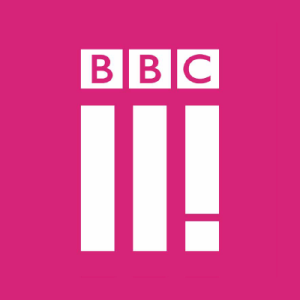
BBC Three’s logo hadn’t been changed in 8 years. This month, they introduced their new visual identity for the channel’s digital switch over, not only sporting a new logo, but also idents, animations and colour scheme. Niki Carr, Head of Marketing at BBC Three explains: “New BBC Three is founded on three principles that underpin everything we do. The first is ‘make me think’ – hard hitting documentaries like Suicide and Me and thought provoking drama like Murdered By My Boyfriend. The second is ‘Make me laugh’- distinctive comedy like People Just Do Nothing or new entertainment shows like Murder In Successville. The third, the exclamation mark, is ‘Give me a voice’, which is what we will do for young people.”
The bright pink colour scheme is vibrant and appealing to the target market, however, the overall design is jarring. The spacing of the BBC compared to the spacing between the three blocks is awkward and has a clunky feel to it and doesn’t effectively convey the meaning behind Niki Carr’s explanation of the three principles. Many have been saying it looks like two in Roman numerals with an exclamation mark, as well as comparing it to a logo in an episode of BBC’s self-parodic sitcom W1A.
The BBC wanted the new logo to work on digital platforms: “…works equally as well on a TV as it does on a smartphone or tablet. It works as an app icon and digital on screen graphic.” and comparing the old logo with the new, it does have a more digital-friendly approach to it, it’s just a shame the logo is so awkward and lacks clarity.
Quentin’s New Logo Design for BBC Three
We got into a lengthy discussion in the Riley and Thomas studio about our dislike for BBC Three’s new logo, that we decided to create our own version! What do you think? Let us know in the comments box at the bottom of the page.
Gumtree New Logo Design
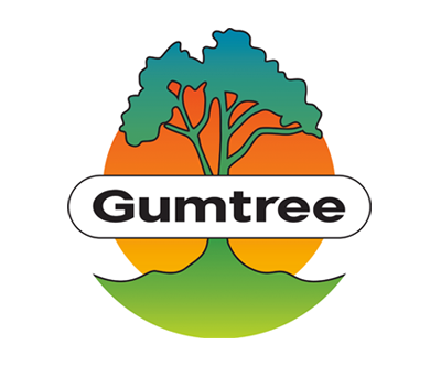
Gumtree have also had a new make over since it’s launch in 2000, making it more digital friendly. After listening to market research the company decided to keep the tree icon, but adopt a cleaner, simplified design, with a new colour palette.
This is a great example of a successful company listening to their consumers and tailoring their identity to the market. The results from the research showed that the majority of consumers would want the tree in the logo. The design agency, Koto used the findings and “…created a new simpler tree to make it more ownable, keeping all the positive natural connotations of growth, stability and diversity whilst making an instantly recognisable icon.”
The tree icon not only has an organic and fluid feel to it, but also gives a subtle nod to digital, user-friendly design. The colour palette is fresh and inspiring, where Koto took the colours from the unique multi-hued bark of the Rainbow Eucalyptus tree.
Overall the new identity with the bright green of the logo against the colour palette, as well as the minimal, clean typeface is eye-catching, simple and very effective.
Pearson New Logo Design
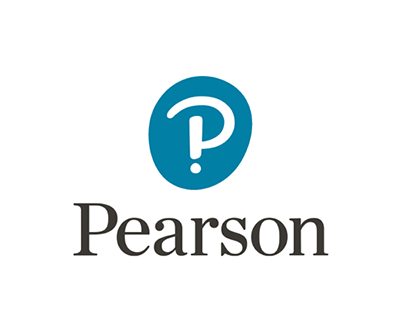
Together Design has created a new brand for Pearson, a multi national publishing and education company. “To support its transition from educational print publisher to a digital and services-led learning business, Pearson needed a new master brand to help it stand out from the competition, unify its broad and diverse portfolio of products and services, and serve as an anchor for its 40,000 employees worldwide.” (Together Design)
The new logo definitely has more character, with the subtle handwritten feel of the ‘P’ encased in the soft edged, muted blue oval. The ‘P’ is also cleverly formed from an exclamation mark and question mark, adding a quirky feel to the identity. This look appeals to the educational aspect of their market, and highlights the diversity of their products. The change of the serif typeface from all caps to lowercase also makes the name more legible and recognisable.
The muted, soft characteristics of the Pearson logo is contrasted with a vibrant colour palette that reflects “…the curiosity and excitement of learning.” (Rebecca Sinclair, VP global brand architect at Pearson) and gives the overall identity a unique and dramatic look.
Watch this space…
Riley and Thomas are currently working on refreshing an exciting brand and website. Look out for the unveiling in a few weeks!


