The Impact of Colour Psychology on Branding Design
BRANDING DESIGN UK
At Riley & Thomas, a premier branding and creative agency based in the picturesque Cotswolds, we believe that effective branding design goes beyond mere aesthetics.
It’s about creating an emotional connection with your audience, and one of the most potent tools for achieving this is colour. Colour psychology explores how different hues influence human emotions and behaviours, making it a critical component of successful branding design.
The Power of Colour in Branding Design UK
Colours are more than just visual elements; they convey messages and evoke feelings that can profoundly affect consumer perceptions and decisions. This is why the strategic use of colour is essential in branding design. Consider the iconic red of Coca-Cola, which exudes excitement and energy, or the calming blue of Facebook, which promotes trust and reliability. These choices are deliberate and rooted in psychological principles that drive consumer behaviour, making them essential in branding design.


Understanding the Psychological Impact of Colours
Let’s explore some common colours and their psychological impacts in branding design:
Red: Red is a powerful colour associated with energy, passion, and urgency. It can evoke strong emotions and create a sense of excitement. Brands like Coca-Cola and Netflix use red to draw attention and stimulate a sense of enthusiasm and urgency in their branding design.
Orange: Combining the energy of red and the happiness of yellow, orange is associated with enthusiasm, creativity, and adventure. Brands like Harley-Davidson and Fanta use orange to evoke excitement and a sense of fun in their branding design.
Yellow: Yellow exudes happiness, optimism, and warmth. It’s an inviting colour that can grab attention and evoke feelings of cheerfulness. Brands like McDonald’s and IKEA use yellow to create a friendly and approachable image, enhancing their branding design.
Green: Associated with nature, health, and tranquillity, green is often used by brands that emphasise eco-friendliness and well-being. Companies like Starbucks and Whole Foods use green to highlight their commitment to natural products and sustainability, reflecting this in their branding design.
Blue: Often linked to trust, calmness, and professionalism, blue is a favourite among technology and financial companies. Brands like IBM, Dell, and American Express use blue to convey reliability, security, and stability, fostering a sense of trust and dependability through their branding design.
Purple: Purple is linked to creativity, luxury, and wisdom. It’s often used by brands that want to convey a sense of imagination and high quality. Brands like Cadbury and Hallmark use purple to add a touch of elegance and mystery to their branding design.
Black: Black denotes sophistication, elegance, and authority. It’s a strong, bold colour that can convey luxury and exclusivity. High-end brands like Chanel and Gucci use black to create a sense of sophistication and timelessness, which is central to their branding design.

Applying Colour Psychology in Branding Design
At Riley & Thomas, we incorporate colour psychology into our branding design process to ensure that each brand we create resonates deeply with its target audience. Here’s how we do it:
Understanding the Brand Identity: We start by understanding the core values, mission, and personality of the brand. This helps us choose colours that align with the brand’s essence and message, a crucial step in branding design.
Analysing the Target Audience: Different colours can evoke different reactions based on cultural and personal preferences. We consider the demographics and psychographics of the target audience to choose colours that will resonate with them, enhancing the effectiveness of the branding design.
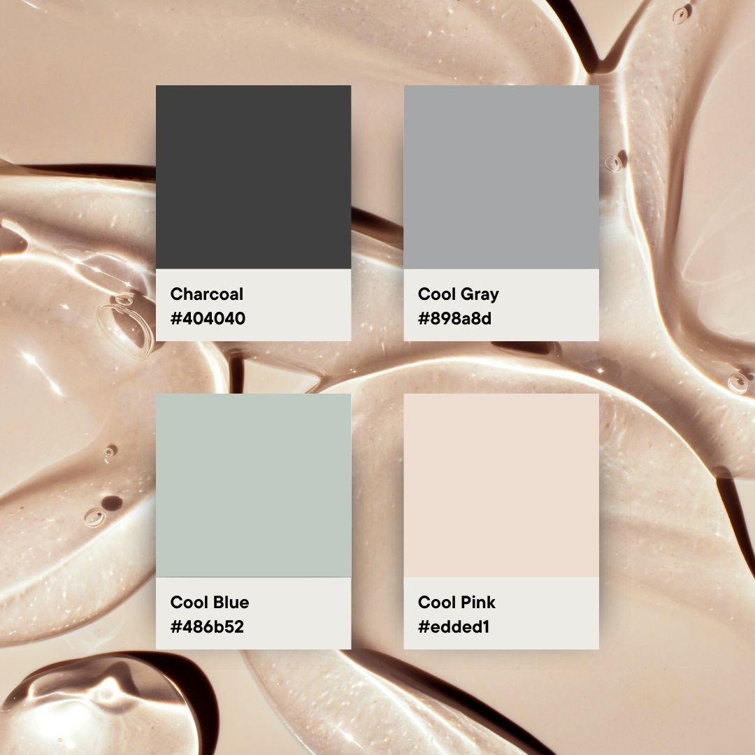
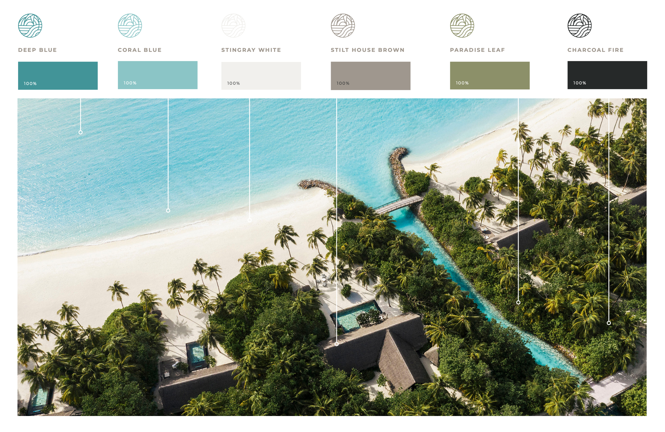
Creating a Colour Palette: We develop a cohesive colour palette that reflects the brand’s identity and appeals to its audience. This palette guides the design of all brand materials, from logos to marketing collateral, ensuring consistency in branding design.
Testing and Feedback: We test the colour choices in various contexts and gather feedback to ensure they evoke the desired emotional responses and effectively communicate the brand message. This iterative process is vital for refining the branding design.
Colour is a powerful tool in branding design that can shape perceptions, evoke emotions, and influence consumer behaviour. At Riley & Thomas, we leverage the psychology of colour to create compelling and effective brand identities that stand out in the marketplace. By understanding and applying the principles of colour psychology, we help our clients connect with their audience on a deeper level and achieve their branding goals. Through strategic colour choices, we enhance the impact and memorability of each branding design we create, ensuring lasting success.
