A Designer’s Perspective on the Pantone Colour of the Year 2024 | Martha Farnworth
PANTONE COLOUR OF THE YEAR 2024: PEACH FUZZ 13-1023TCX

Martha Farnworth
DESIGNER
Every year Pantone release their “Colour of the Year”. This year, the spotlight shines on Peach Fuzz 13-1023TCX, a pastel, inviting hue that exudes a sense of softness and friendliness. While I appreciate the appeal of this colour on its own, It isn’t very practical in the world of branding and design.
MARTHA EXPLAINS…
Peach Fuzz is undeniably charming, embodying a gentle and approachable vibe. However, its practicality in design is somewhat limited. The challenge lies in finding complementary colours that enhance rather than clash with its warm undertones. Unlike some other Pantone Colours of the Year, Peach Fuzz doesn’t seamlessly integrate into a broad spectrum of palettes. This restricts its usage, often relegating it to a standalone role with the support of classic blacks and whites.
One notable hurdle in working with Peach Fuzz is its compatibility with text. As a designer, legibility is paramount, and this delicate colour poses challenges when paired with traditional white text creating unreadable and visually jarring combinations. To maintain the soft and friendly aesthetic, owe would then look to the opposite – black text, but this introduces a stark contrast that contradicts the intended vibe. So instead we would be limited to a subtle grey, creating a balance that complements Peach Fuzz without compromising readability.


The Use Of The Colour
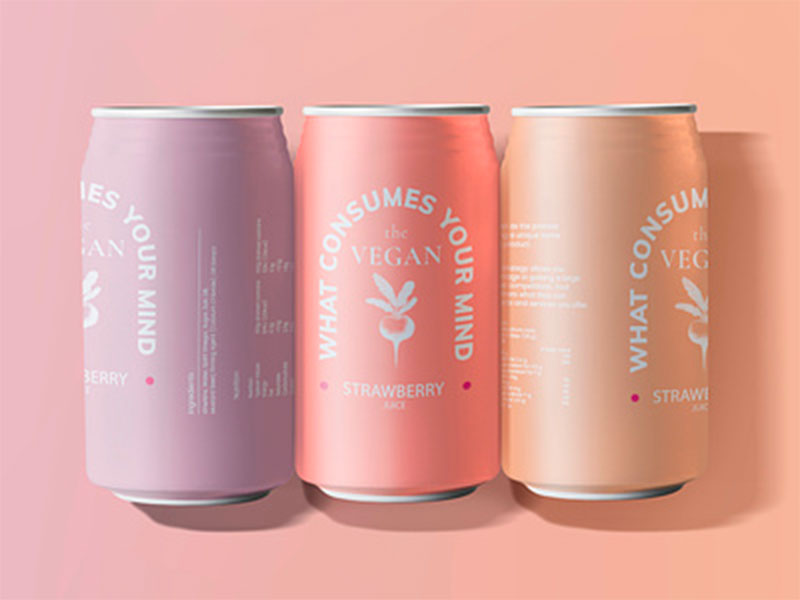
Peach Fuzz seems to resonate particularly well with a female audience. Its warm, nurturing tones evoke a sense of femininity, making it an excellent choice for products targeted at women. This colour can be harnessed to infuse a friendly and approachable aura into various designs, from packaging to branding.
That being said pastel colours like Peach Fuzz 13-1023TCX are becoming increasingly popular in branding and packaging appealing to the younger health and beauty conscious who would see the product behind this colour as matching their vibe, whether it does or not irrelevant.


Mark Boston
SENIOR DESIGNER
“Interestingly I created a palette for a client a few weeks ago that included a similar peach colour. They loved all the colours in the palette apart from the peach! So, it’s not going to be to everyone’s taste. But I can see Peach Fuzz working well for interior design, where there seems to have been a trend for using rich & warm natural hues over the last few years.”
Quentin Thomas
CREATIVE DIRECTOR
“In all honesty, I feel as though we have gone through the haze of pastels over the last few years and as we transition into 2024, we’ve emerged from the subdued palette trends and are now seeking vibrant, bold hues that leave a lasting impact on brands and their identities. As we move into the new year, we are seeing more of a shift towards punchy and dynamic shades that redefine visual expressions and brand aesthetics.”
According to Laurie Pressman – Vice President, Pantone Color Institute™
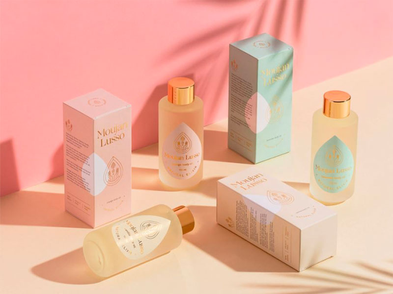
PANTONE 13-1023 Peach Fuzz in Packaging and Multimedia Design
A clean peach tone with a vintage vibe, PANTONE 13-1023 Peach Fuzz reflects the past yet has been refashioned to have a contemporary ambiance, enabling it to seamlessly display its presence in both the physical and digital world.
Seemingly tactile, PANTONE 13-1023 Peach Fuzz welcomes consumers to reach out and touch. Its warm tactility makes it an enticing shade for a variety of products, from food and beverage to cosmetics and accessories. Inspiring thoughts of sweet and delicate tastes and scents, PANTONE 13-1023 Peach Fuzz tempts the taste buds with thoughts of sweet and delicate scents and treats.