Cotswold Alcohol Branding Case Study
Black Lion Vodka
COTSWOLD ALCOHOL BRANDING
Customers judge a product before they’ve even tasted it.
When building an alcohol brand from the ground up, it’s important to always put your best foot forward. This idea of buying with our eyes and being influenced by the brand’s story and ethos means as designers, we need to reflect this in our alcohol packaging.
The provenance of the brand
Black Lion Vodka is a family-owned, Cotswolds-based, British business with a passion for adventure. Owners Tim and Tanya thought it would be a brilliant idea to convert an otherwise waste product into the UK’s first sheep’s milk vodka. The business has been 3 years in the making with the vision always being to enter the spirits industry with their niche alcoholic beverage made from a rare breed of sheep, Black Lion. With most vodkas being made from grains, potatoes or grapes, Tim and Tanya saw an opportunity. This opportunity allowed them to put a unique distilling process and their rare breed of sheep firmly on the map.
After looking for a website and branding agency to turn their vision into a reality, Tim and Tanya appointed Riley and Thomas to complete their website, branding, marketing and SEO. This partnership has been a match made in heaven due to everyone’s passion for sustainability and provenance.
‘SUSTAINABILITY IS THE KEY TO OUR SUCCESS & SURVIVAL.’
After understanding Black Lion Vodka’s mission, vision and values, our team went away and began designing each element of this unique brands packaging.
Your products packaging not only has to protect the product but it needs to reflect each aspect of your brand and what you stand for. How your packaging looks will affect the value of your product and ultimately how many sales you make. The main areas our team have to focus on when designing alcohol packaging is; protection, convenience and labelling. We then have to ensure all regulations are adhered to and the product is transportable.
Read more on the alcohol branding we designed for the UK’s first sheep’s milk vodka.
How the packaging reflects its brand story
Tim and Tanya believe that sustainability is the key to their farm’s success and survival. This concept gives them the opportunity to develop new ways to transform a waste product into a niche and innovative drink. With sustainability being a core brand value, we needed to reflect this in the packaging. This means reducing single-use plastics and opting for 100% recyclable packaging. We have also used glass bottles which are recyclable and synthetic corks which are reusable.
In order to successfully convey their band story through the packaging, we needed to showcase the brand’s sense of provenance, passion, quality and spirit of adventure. Therefore, we have achieved this through a crisp, clean and elegantly designed bottle label and outer tube.
‘WE BELIEVE IN THE NECESSITY OF REDUCING OUR WASTE AS A BUSINESS.’
To showcase the sense of provenance and adventure, we utilised the Edelweiss flower which symbolises courage, bravery and love. This symbol, not only features on the packaging but there is also a subtle flavour within the vodka. Because this brand has a Swiss twist, it’s fitting that the Edelweiss flower is also Switzerland’s national flower.
This is where our team really research and ensure every element of the brand falls into place from tasting, packaging and the all-important story.
The packaging we have designed not only reflects the brand’s mission, vision and values but it coneys the brand USP perfectly and that’s rare vodka!

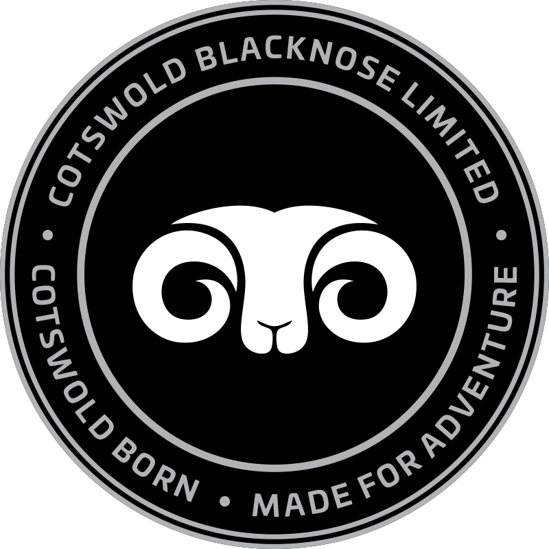
The signature rams head icon.
Making your mark in the alcohol industry is challenging without an eye-catching icon. This icon will draw your consumer’s eyes towards your product and make it easier to spot amongst competitors. We wanted to create something unique yet symbolic for Tim and Tanya – Hence the rams head. The rams head sparks intrigue amongst customers, reflects the brand story, and gives a nod to the provenance behind the sheep producing the all-important waste product.
This means that we decided that the rams head features across all aspects of the Black Lion Vodka packaging, this is to help raise awareness for the rare Valais Blacknose sheep and educate consumers about where their vodka comes from.

Why we chose the bottle and tube.
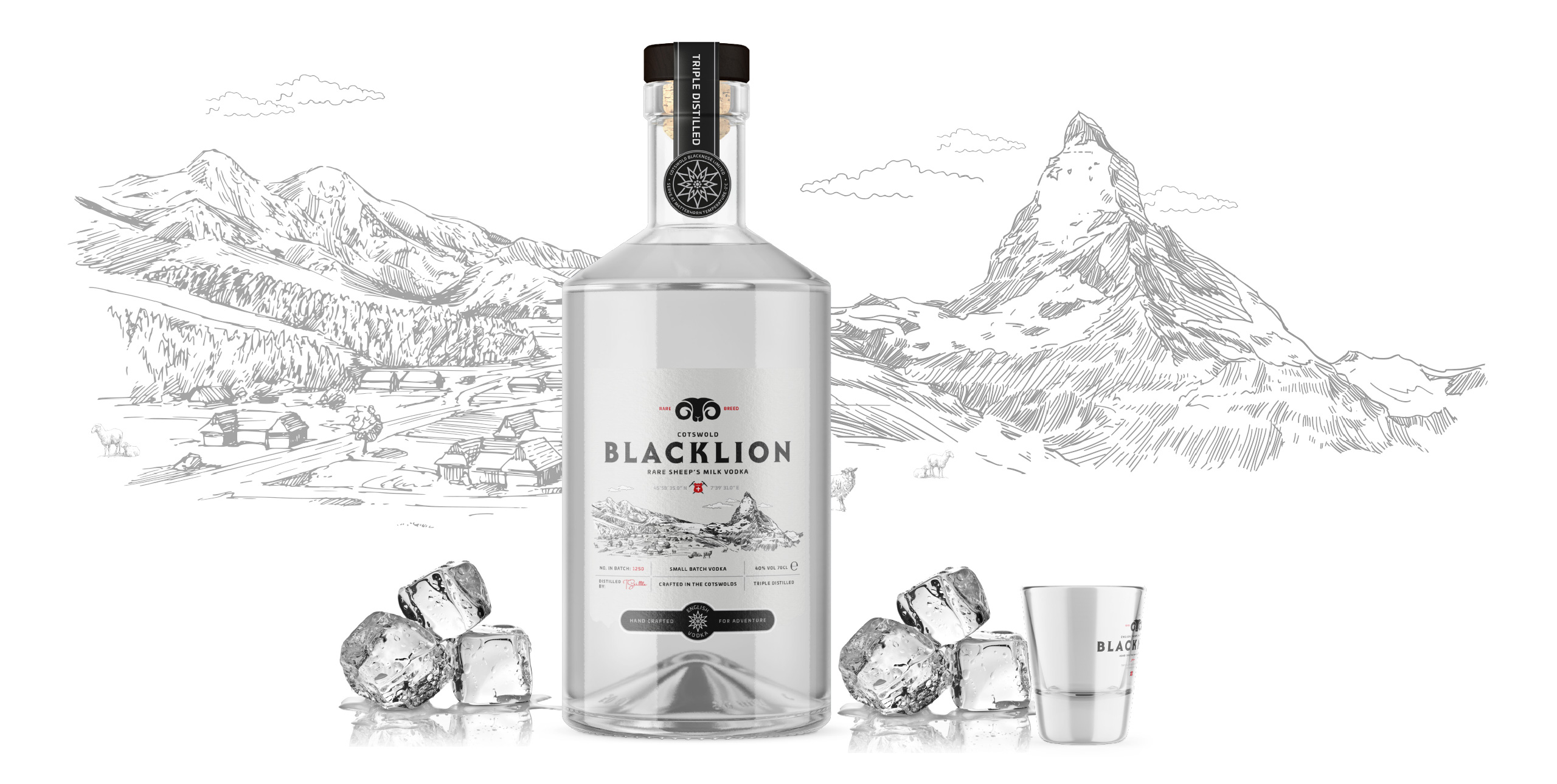
Black Lion Vodka will be launching initially with a beautiful 70cl glass bottle with synthetic cork. This bottle is made from thick durable glass to ensure the contents is well protected. It features a raised base which is one of the reasons for choosing this style of bottle. The raised base created the illusion of the Matterhorn mountain rising from the inside of the bottle – This feature helps to convey the brand story.
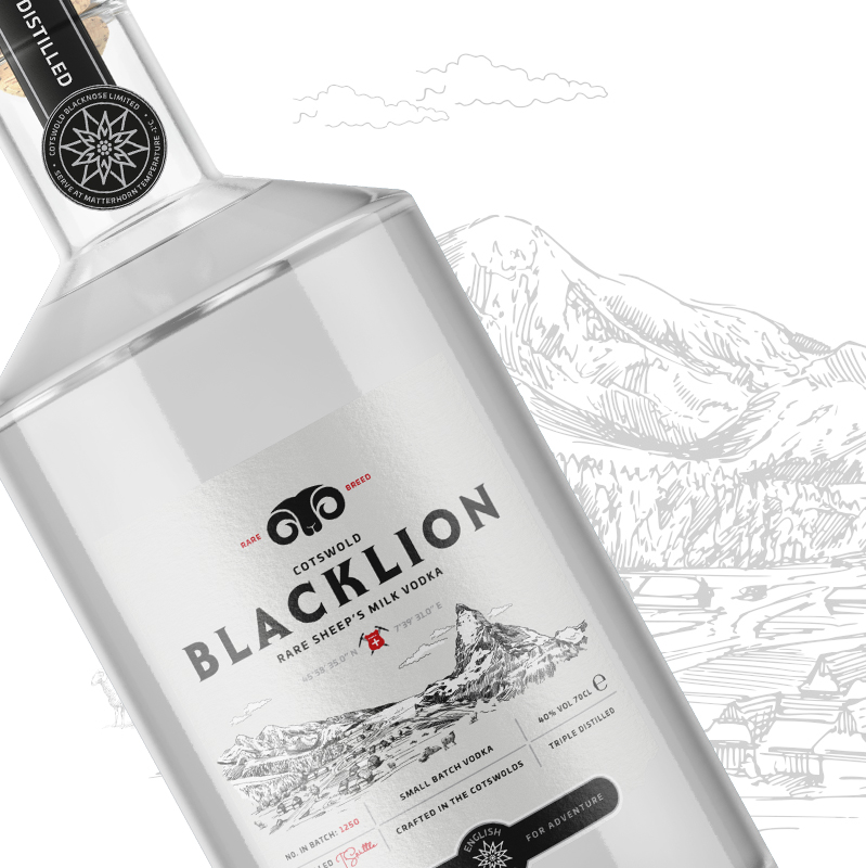
Riley and Thomas designed the bottle label to present each aspect of the brand in a captivating way. We used a combination of embossing elements and silver foiling elements to highlight areas of the branding we wanted customers to take note of. Adding the embossed elements creates a luxurious feel to the label.
‘THIS JOURNEY HAS BEEN 3 YEARS IN THE MAKING.’
We played with a variety of label ideas however we have all concluded that the matte-finished and frosted label with silver foil is the one. This frosted effect makes the mountain scene on the front of the bottle come to life. This mountain scene is a blend of the Cotswolds and the Matterhorn Mountain so this snowy/frosted effect is perfect for bringing the brand’s provenance and adventurous side to life. We have then designed the black bottle label in the same frosted effect ensuring the barcode is visible and scannable.
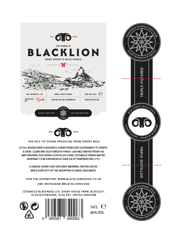
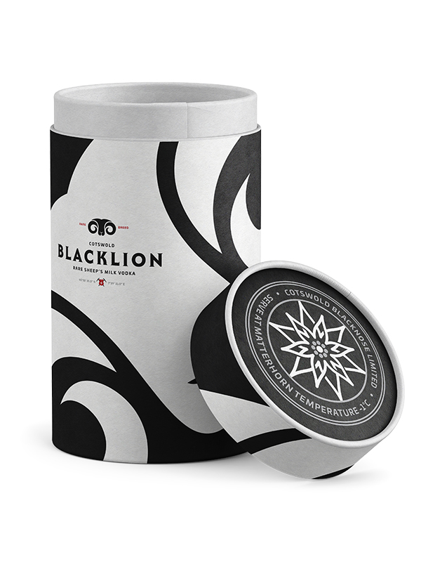
We believe having a cork gives a more luxurious feel to the product. With our target market being wealthy individuals, the packaging is everything. When deciding on the bottle, cork and tube, we needed to consider how we would design each element to not only justify the price bracket but also appeal to our desired target market. When the bottle is purchased, customers will receive the bottle encased in a sophisticated tube with a point of sale leaflet included in the tube.
This point of sale leaflet is the perfect addition to Black Lion’s packaging because it helps to convey the brands messaging as well as offer cocktail recipes. We have designed this leaflet with a glossy finish and plenty of imagery to showcase the brand values!
The outer tube is the start of the customer’s experience. This tube has a dual purpose; to protect and to add an element of luxury. This tube has been made out of cardboard and printed on the outer side with a rams head style design. The logo featured on the tube also be embossed and foiled to mirror the bottle label. As you can see the top tube print features the Edelweiss design which will be silver foiled to add an extra element of luxury to this unique brands packaging.
